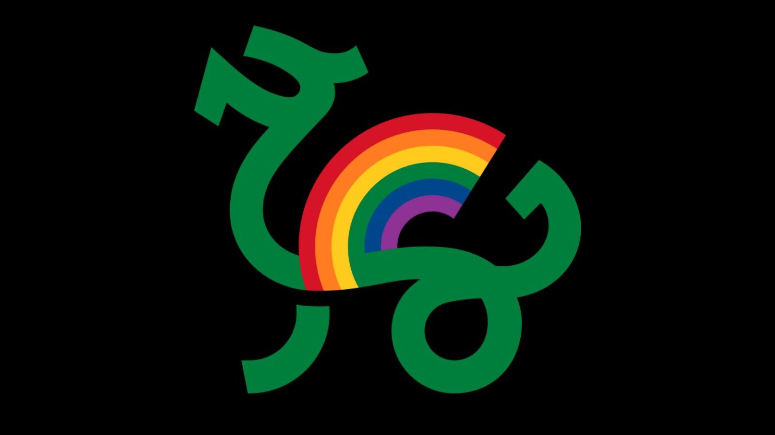
Creating our Annual Conference logo

As we get ready for our Annual Conference in October, we’re excited to share the collaborative design process for our Ljubljana 2023 visual identity.
Every year ILGA-Europe bring our Annual Conference to a different city in Europe, and every year we create a new logo to single it out as an important event in its own right, rather than simply another annual gathering of activists. And every year, we begin the work by consulting with our member organisations on what the elements might be that express the identities of the countries and cities our Conference is being held in. We ask them too to recommend designers in the hope that we can source local talent.
Developing the concept
This year we worked with Studio 360, an amazing creative agency in Ljubljana. We asked for a logo that combined a symbol of the city or of Slovenia, which reflected both the strength of our movement and our title for this year’s conference, “Rising To The Moment”. Studio 360 made two proposals for key symbols, one using of the national symbol of Slovenia which is represented on the country’s flag, Mount Triglav, and the other using Ljubljana’s city emblem, the dragon.
Our designer first combined a creative imagining of an existing modern statue of a dragon in Ljubljana, combining colours from the rainbow flag with the dragon’s wings to suggest the LGBTI movement rising.
The second proposal took the peaks of Mount Triglav, combining them with the rainbow colours and a symbol for rising, to again tie in with the conference title.
How we made our decision
Initially we liked the second version of the logo, based on Mount Triglav’s peaks. We felt it was a strong symbol of upwards movement, of ‘rising’, and it’s simplicity appealed to us.
Then we went through a process of consultation, with the Conference organising team and with our hosts. Their feedback was unanimously different. It was felt that the Mount Triglav version of the logo was more corporate than community, that it was harder to really identify the local symbolism, and that it wasn’t as pleasing to look at. It was also felt that the dragon was a more identifiable Slovenian emblem. We went with the feedback and Studio 360 further developed the logo, along with the conference title until we came up with the final design.
We’re really delighted with the final result, which we think both encapsulates the spirit of our Conference this year and represents an iconic, historic emblem of the beautiful city of Ljubljana. We’re looking forward to joining 450 activists from across Europe and Central Asia there this coming October for what promises to be a Conference to remember!