How we created our brand-new website to support LGBTI activism

After 18 months of planning and work, the team at ILGA-Europe are proud to introduce our brand-new website. It shows the range of work we do and LGBTI activists and organisations can now easily find the information they need. Keep reading to learn more about how it was developed and how you can make the most of it.
What a journey it’s been! Almost two years ago, ILGA-Europe’s communications team took the first steps towards the renovation of the organisation’s website. The previous version dated from 2015 and so much has happened in the organisation and in the LGBTI movement ever since.
These changes had to be reflected in our digital home. The same way we take care of a house, our website desperately needed a spring cleaning, a rearrangement of the furniture, accessible rooms for all, and brighter colours on the walls. And there were thousands upon thousands of pages, which all had to find their own special place in our new digital house, with a new hierarchy, which made them easily to find.
Working together with SOLOS, a fabulous communication and image agency based in Portugal, we re-imagined the structure and design of our site to streamline the access to information, express in simpler but more dynamic ways the complex work we do, be closer to visitors and make them feel part of the ILGA-Europe community, and to be connected to and useful for our 600-plus membership organisations across Europe and Central Asia, and other LGBTI activists and allies.
Here is what LGBTI activists can find on our new website:
An expanded visual identity
We are happy with ILGA-Europe’s current logo and didn’t want to change it, but we wanted to find a way to extend it beyond the rainbow colours that feature prominently on it, so that our brand-new website would be able to represent the real diversity and intersectionality of our community. The solution the SOLOS design team came up with was to take the coloured dots on what we internally call ‘the tail’ of the ILGA-Europe logo and expand them into a series of animated circles that feature gradients of colours to represent everyone in and every part of our wonderful LGBTI community.
These gradient circles underpin the entire design of the site, and the colours used across its pages. We combined them with a lot of white space so that the website would feel light and accessible instead of dense and off-putting.
Less words, more colour
Remember our old website?
This is how the same page looks in the new website:
Words filled most of the screen in our old pages and while it’s mainly through language that we continue to share what we do and know, alongside resources that may be useful for you, the layout is now less dense and visual elements have more prominence.
Instead of receiving all the information at a first glance, now you can comfortably navigate it by scrolling.
Accessibility for all
A priority throughout the whole process was to make all the website accessible and inclusive for all. The needs of people with visual impairments were at the forefront when testing and selecting fonts, colours and composition. Furthermore, now users can choose the colour schemes and font sizes that work best for them in each and every page.
Finding what you need
The top menu consists of five sections:
- Under About us you will find everything you need to know about our organisation.
- Supporting the movement and Advocacy: These sections compile the work we do, on one hand, empowering LGBTI activists and organisations across Europe and Central Asia and on the other, advocating for the protection of the fundamental rights of LGBTI people in our regions.
- Under Rainbow Europe you will find two of our vital publications on the situation of LGBTI people, the Rainbow Map & Index and the Annual Review.
- Under News you will find our latest publications.
In the “burger menu” (the circle button containing three horizontal lines) you will find the same sections in a dedicated page. There you will find the Donate button too, with which you can support the work we do!
The search function
Internet users have got used to the comfort of typing a word instead of combing section after section to find what they need. That’s why our website now has an optimised search button providing you with useful and meaningful results, which you can filter until you find exactly what you need.
Date, type, topic, tag
You can also navigate our content by date, type, topic or tag. Topics correspond to the areas of our advocacy work and here you will find the content organised by portfolio, while the tags describe what the content is about. There are many more tags than topics. You can combine different options from the date, type, topic and tags lists to target your search.
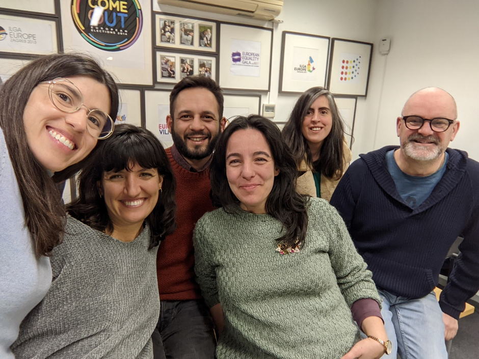
We hope you enjoy our new website! Here’s an image of a group of SOLOS team members with the ILGA-Europe’s communication’s team after three days of intense work in Brussels in April 2022. We want to thank SOLOS once again for coming along with us in this journey!